Role / Lead UX Designer, UX Researcher
Responsibilities / Conducting interviews, paper and digital wire-framing, low and high-fidelity prototyping, conducting usability studies, accounting for accessibility and iterating on designs.
The Product
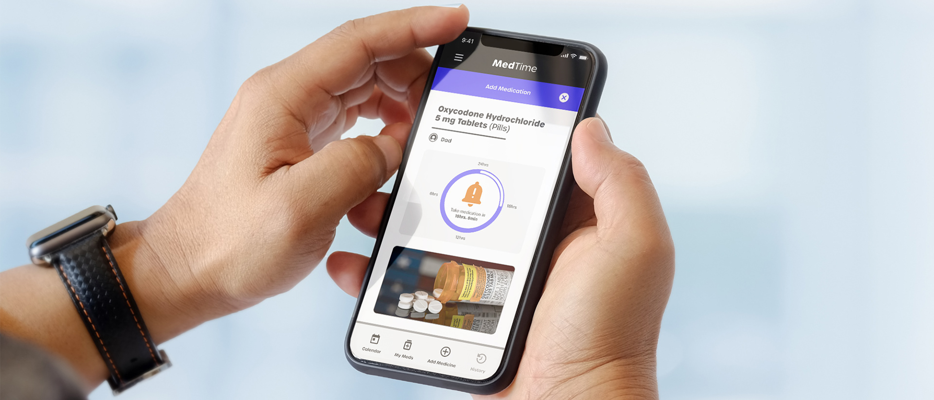
MedTime is a smartphone app which helps people remember to take their medication.
The Problem
Daily medications have different requirements and timing.
The Goal
Create an experience that gives people the confidence they won't forget their many medications.
Target Audience
Anyone taking daily medication. Sweet-spot Adults 40-75yrs.
User Research
To understand the people who are looking for help with their medications, my primary research method was to interview a diverse group that has different experiences when interacting with websites and mobile apps.
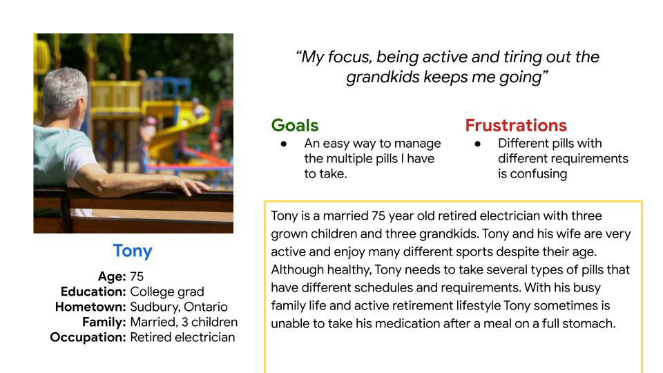
A primary user group identified through research was retired or almost retired people with multiple medications taken throughout the day.
Problem Statement
Tony is a 75-year-old active, grandfather who takes several pills daily and needs an easy way to remember his medication and their requirements because he sometimes feels overwhelmed and confused with several different pills to manage.
Starting The Design
Some ideation with Crazy 8s started the sketching process leading to low-fidelity and eventually high-fidelity layouts and prototyping.
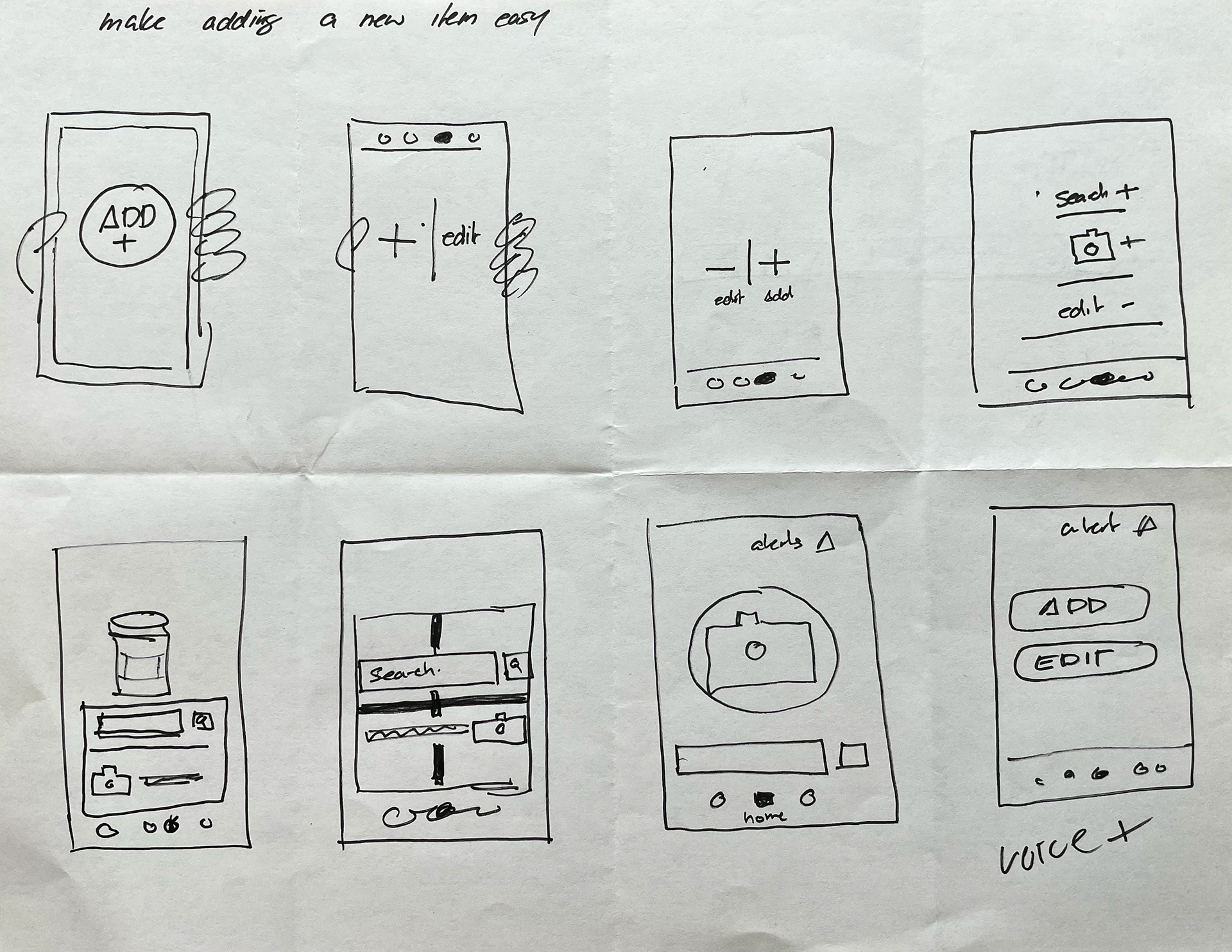
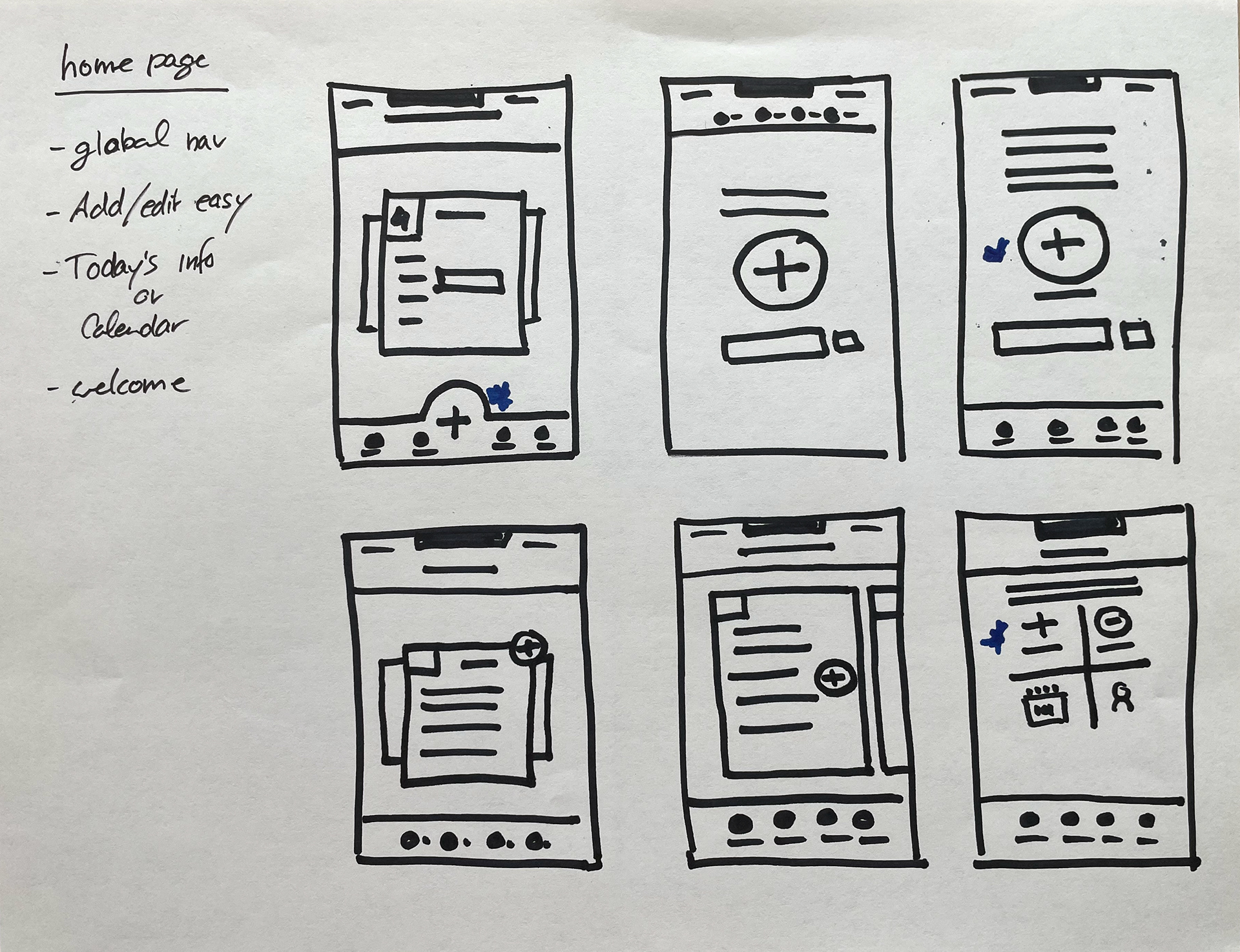
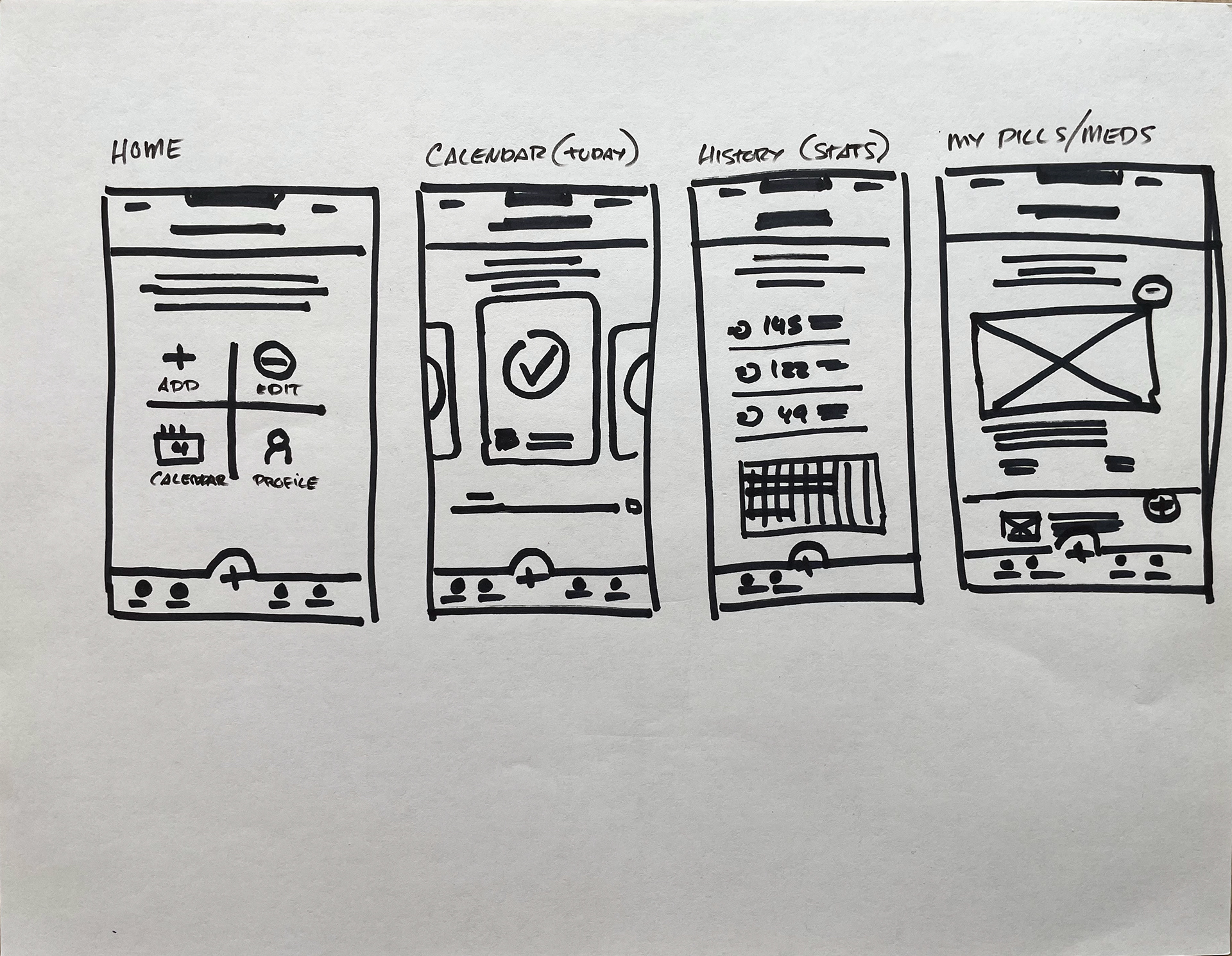
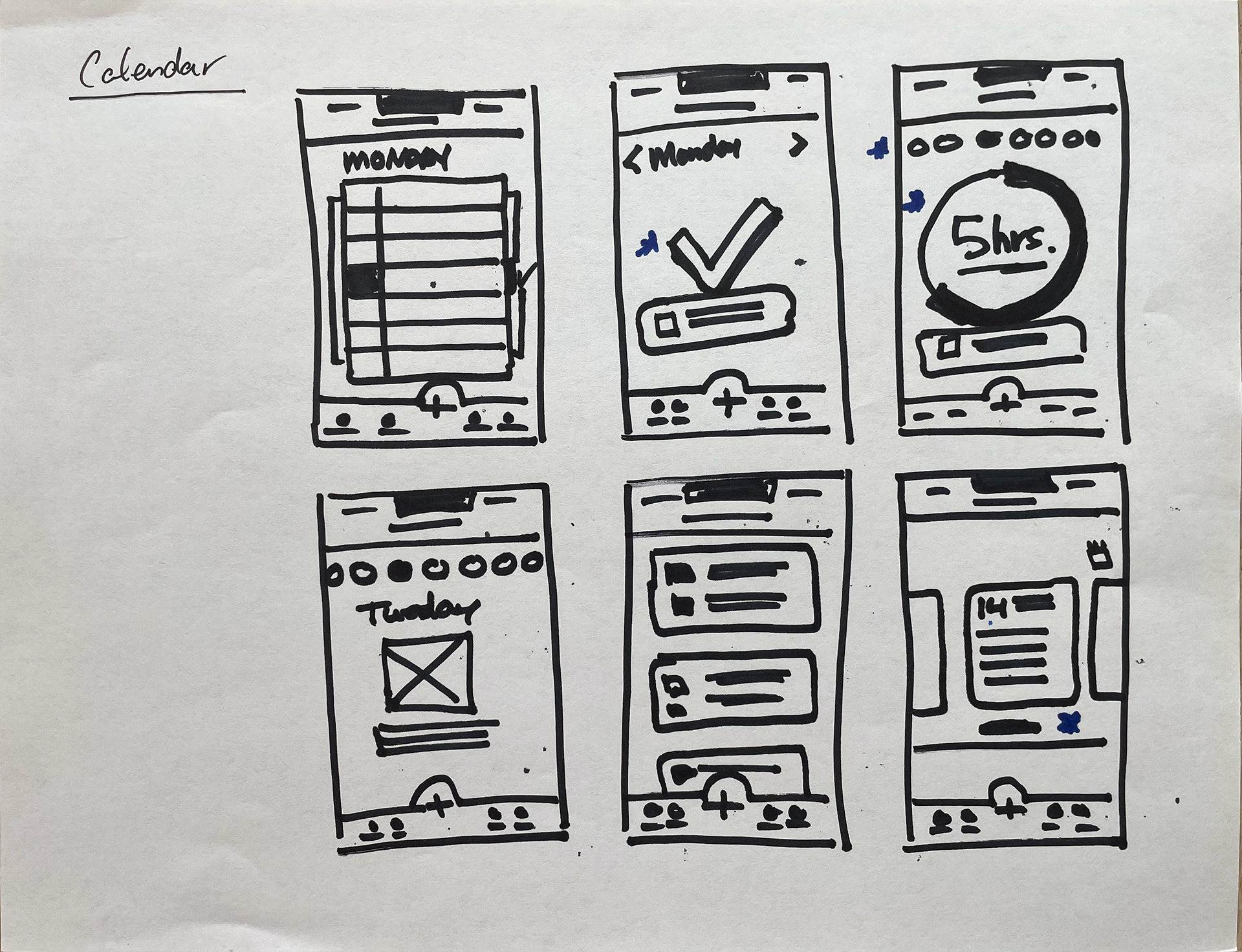
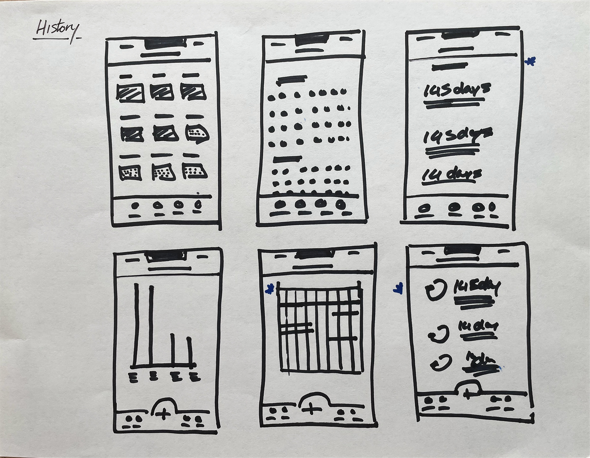
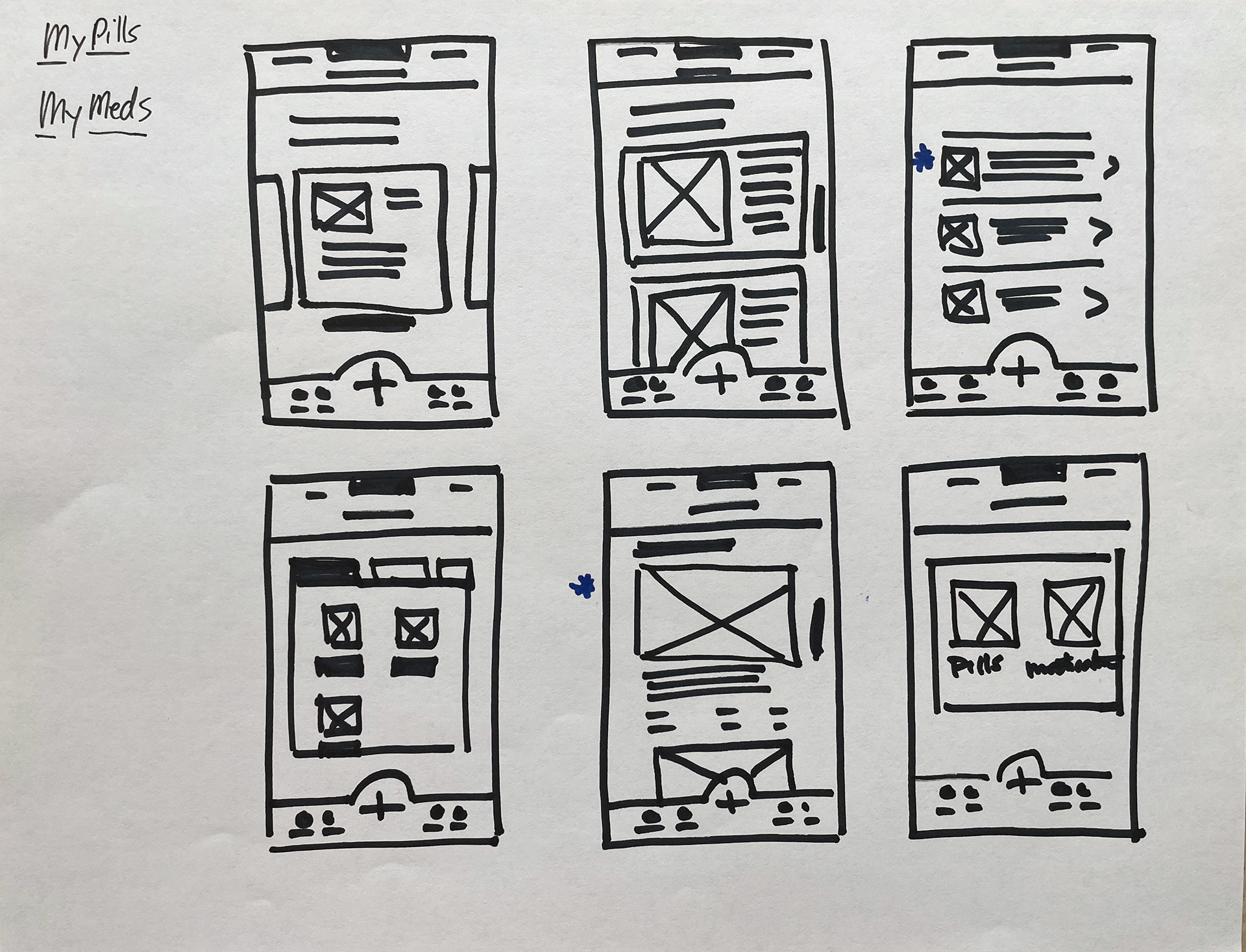
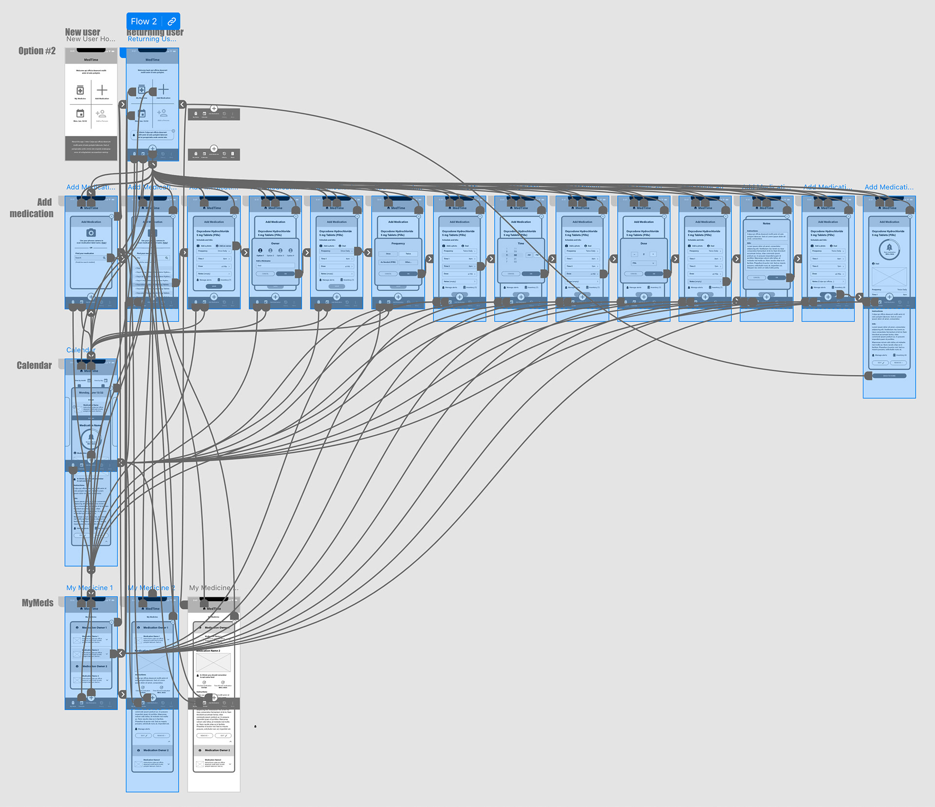
Low-Fidelity Prototype
Prioritizing the "add medication" functionality and the flow associated since this is the primary action of the app.
Usability Results
The main findings uncovered include:
1. Users need an obvious way to navigate home.
2. Alerts should be added to as many places as applicable.
3. All users need to understand the functionality of the “+” (add medication) button.
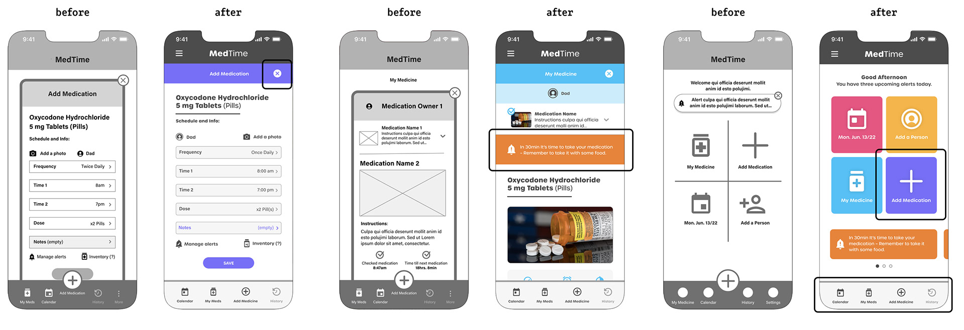
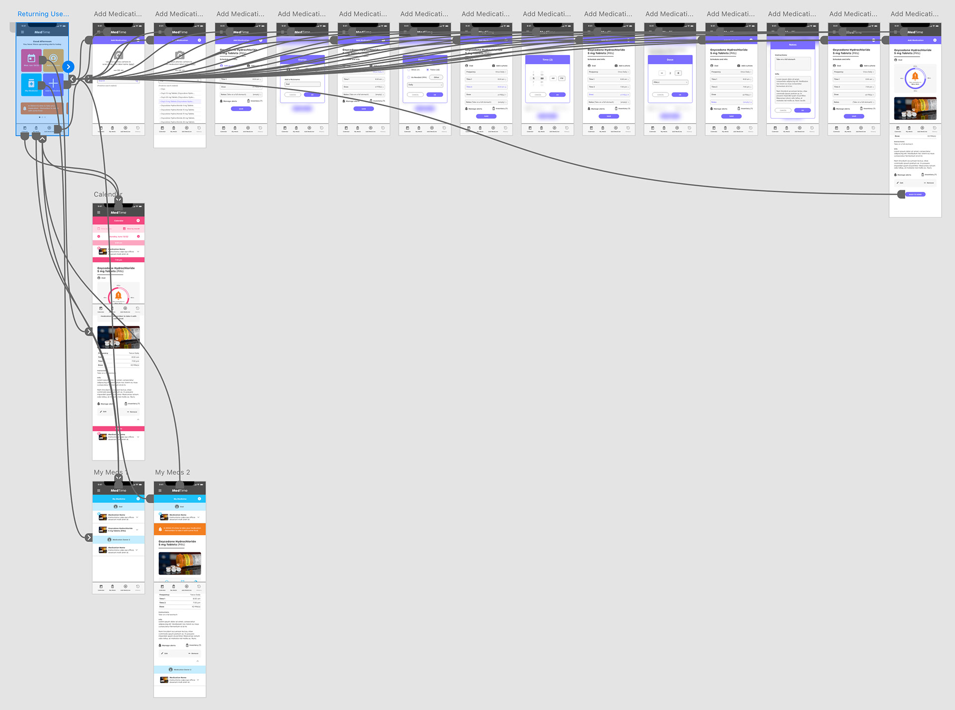
High-Fidelity Prototype
The final high-fidelity prototype refined the design even further by simplifying the layouts and integrating "alerts" wherever possible.
Conclusion
The app had a very simple goal to get people to add their medications – the app would then deliver alerts (reminders) when appropriate. User testing and peer reviews simplified the layouts throughout the design process. Although I'm happy with the outcome and the simplicity of the design, more user testing is needed to hone the "add medication" process even further.
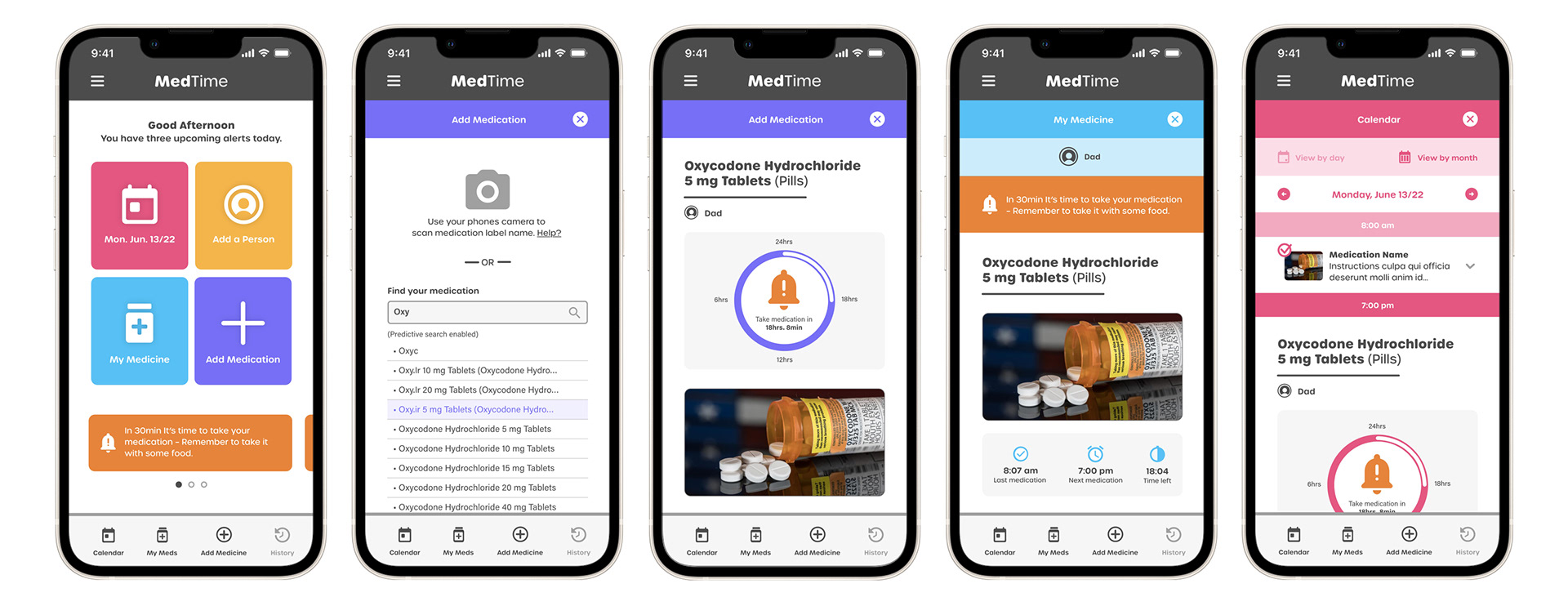
Key Final Screens