Role / Lead UX Designer, UX Researcher
Responsibilities / Conducting interviews, paper and digital wire-framing, low and high-fidelity prototyping, conducting usability studies, accounting for accessibility and iterating on designs.
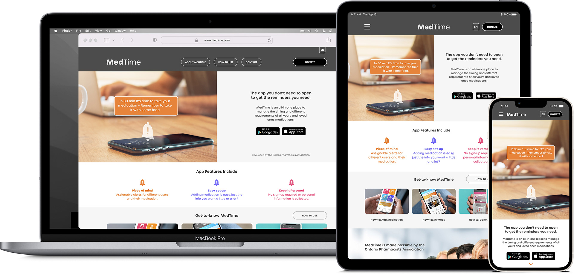
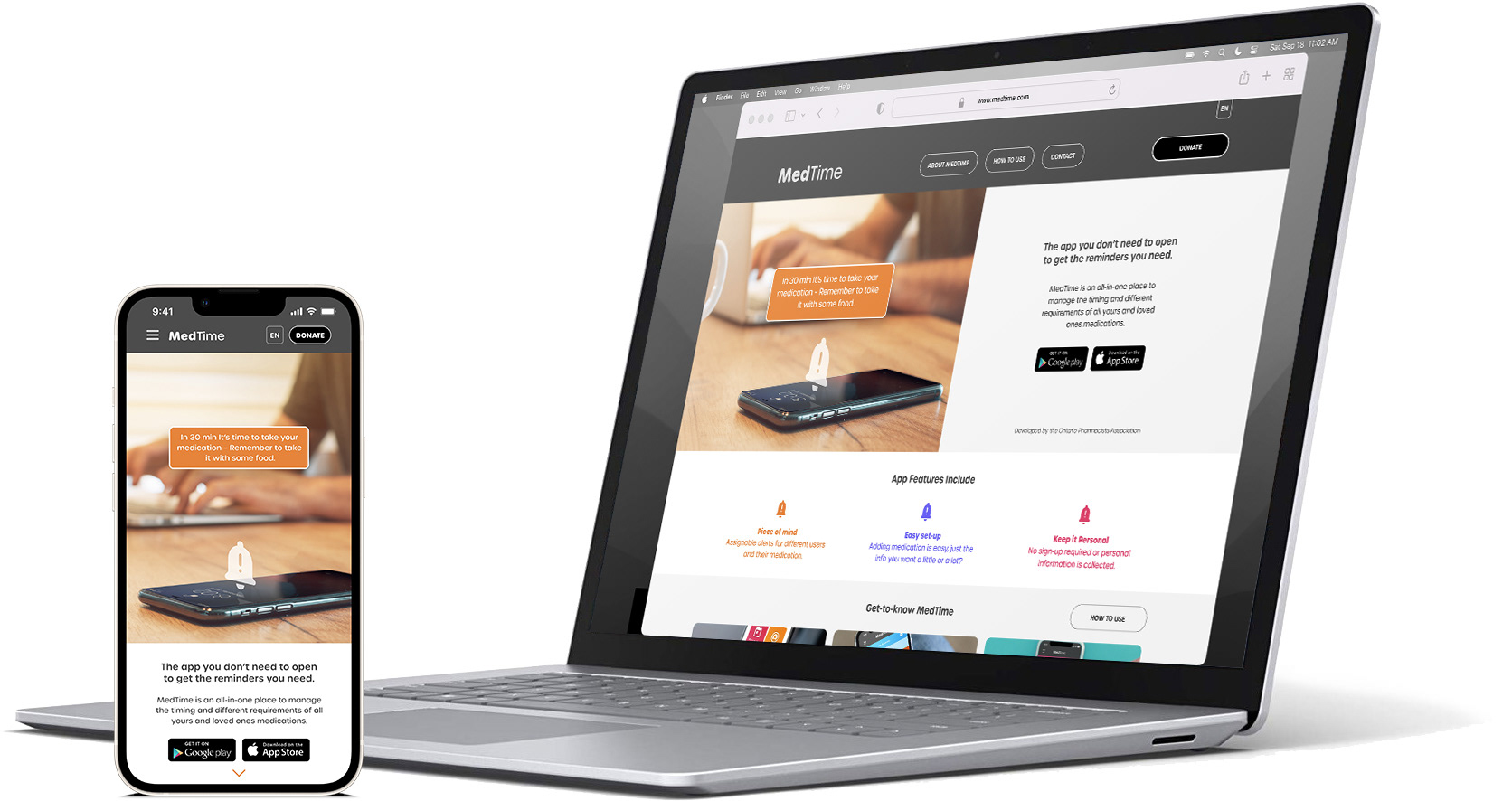
The Product
A promotional website for the MedTime app which helps people remember to take their medications. The website has two main goals, first explain why someone would need the app – driving to downloads. Second, because this is made possible by a not-for-profit organization, donations are important so initiatives like this can continue to serve the community.
The Problem
Identifying pain points people have when donating money in a digital space.
The Goal
Create an experience that gives people the info they need to download the app at the same time as providing a stress-free donation process.
Target Audience
Anyone taking daily medication or someone looking to help a loved one. Sweet-spot Adults 40-75yrs.
User Research
To understand the people who are looking for help with their medications, my primary research method was to interview a diverse group that has different experiences when interacting with websites and mobile apps.
A primary user group identified through research was retired or almost retired with multiple medications taken throughout the day.
Problem Statement
Tony is a 75-year-old active, grandfather who takes several pills daily and needs an easy way to remember his medication and their requirements because he sometimes feels overwhelmed and confused with several different pills to manage.

Starting The Responsive Design
Some ideation with Crazy 8s started the sketching process leading to low-fidelity and eventually high-fidelity layouts and prototyping.
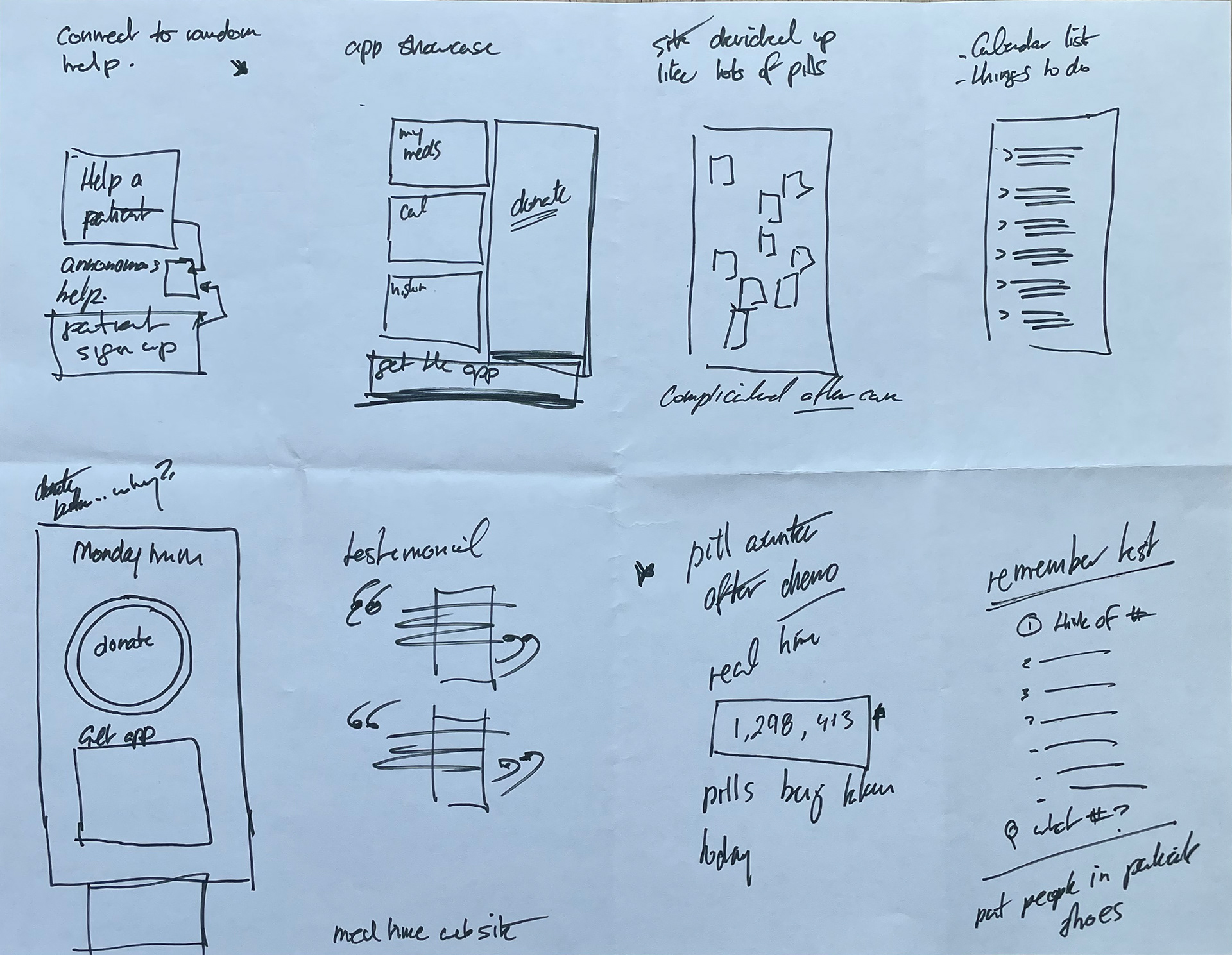


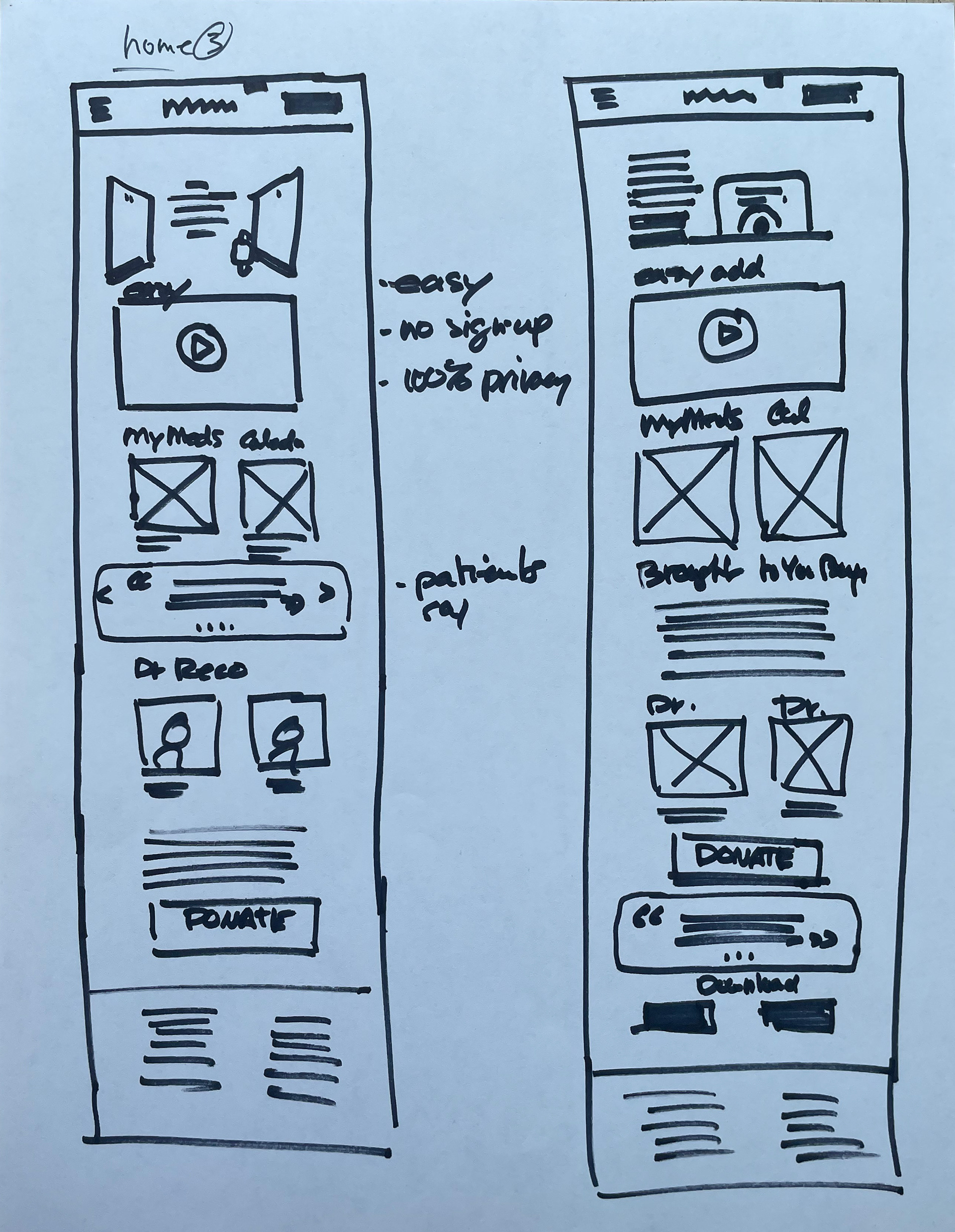

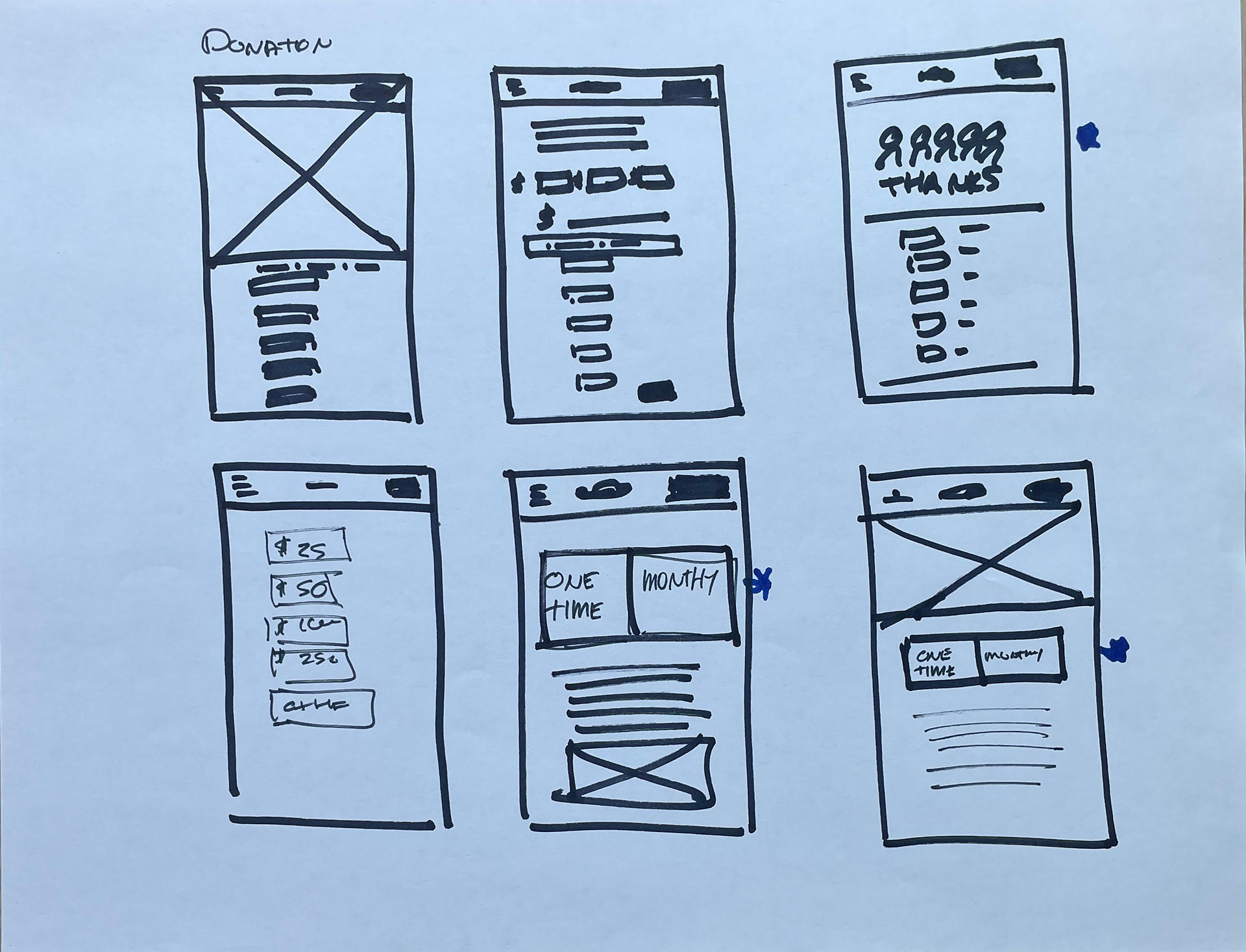
Low-Fidelity Prototype
Prioritizing an easy-to-follow donation flow while keeping most of the persuading on the main page of the site.
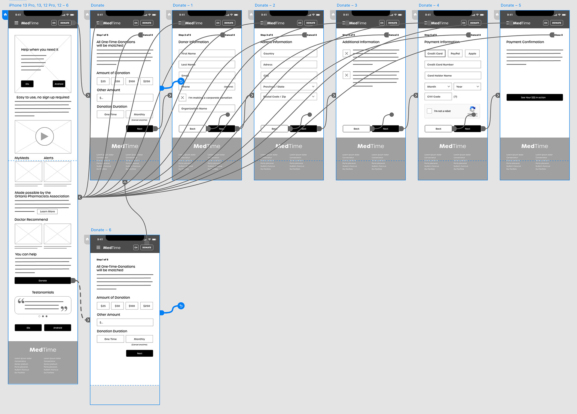
Usability Study Results
Two rounds of unmoderated user testing with five participants. Both low and high-fidelity prototypes highlighted the importance of being simple and obvious during the “Donation” process.
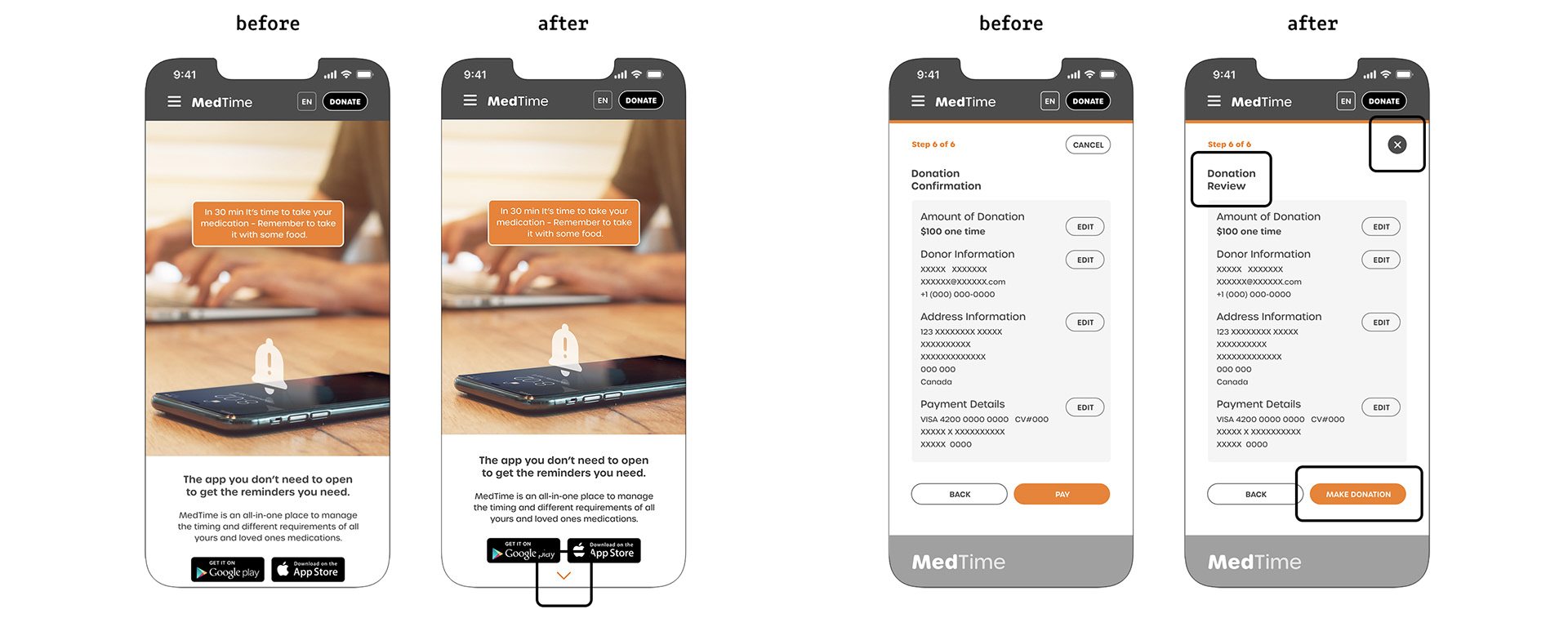
Round 1 Findings
1. Keep the donation amount visible throughout the process.
2. Steps titles need to be defined better.
Round 2 Findings
1. It needs to be obvious that the site is “scrollable” with more content below.
2. The “Donate Confirmation” page should change to be a “Review” page.
3. All the buttons look very similar but have different functions (cancel button).
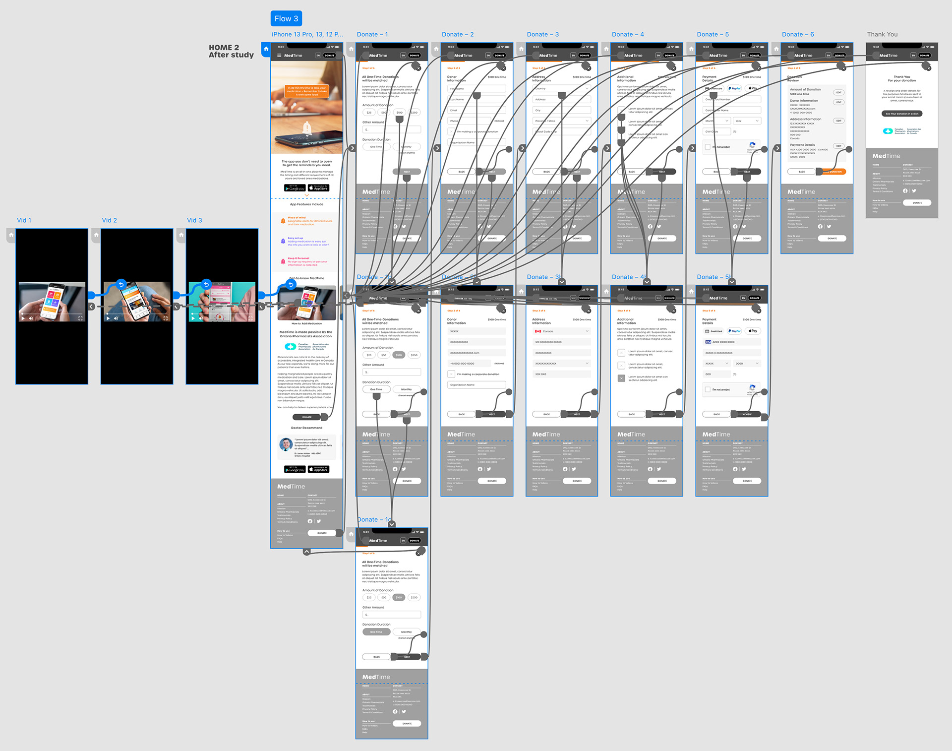
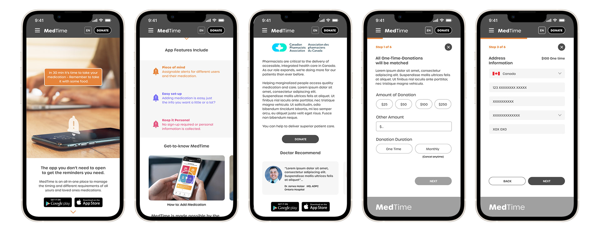
High-Fidelity Prototype
The final high-fidelity prototype refined the labels and navigation buttons to better reflect the function of the pages.
Conclusion
The website needed to deliver on two simple goals, first explain why someone would need the MedTime app and second drive to donate. Through testing and versioning, I discovered that the little things in the “Donating” flow are crucial for a user to complete the task, also keeping steps the same on all devices alleviated frustrations and concerns of security.
– Keep it obvious, keep it clear.
Key Final Screens