
Role / Lead UX Designer, UX Researcher
Responsibilities / Conducting interviews, paper and digital wire-framing, low and high-fidelity prototyping, conducting usability studies, accounting for accessibility and iterating on designs.
The Product
A mobile ordering app for a busy downtown restaurant. “Tasty’s Tomato” has a Chef’s Menu that is always changing and promotes seasonal fresh plates from local suppliers.
The Problem
Identifying pain points people have when ordering new or unfamiliar items off a restaurant's menu.
The Goal
Create an experience that lets people discover more food options on their favourite restaurant app.
Target Audience
People who live in large urban centres. Sweet-spot adults both male and female 20-40yrs.
User Research
To understand the target group, my primary research method was to interview a range of people who’ve had different experiences when interacting with restaurant ordering apps. A primary user group identified through research was young working professionals who enjoy a rich urban environment and engage in a healthy lifestyle.
My assumption before I started the research was the reason people order the same thing over and over is they lack time and energy. This user group confirmed initial assumptions about restaurant app users, but research also revealed that time was not the only factor limiting users from ordering new food items.
Problem Statement
Aimee is a 29-year-old writer living in a busy city who needs a better way to discover and taste all the city has to offer. Right now, limited descriptions of food items mean she repeats the same food orders again and again.

Starting The Design
Iterations of each screen of the app on paper ensured that the elements that made it to digital wireframes would be well-suited to address user pain points. For the home screen, I prioritized content that was easy to interact with while also filtering all new food to the customer.
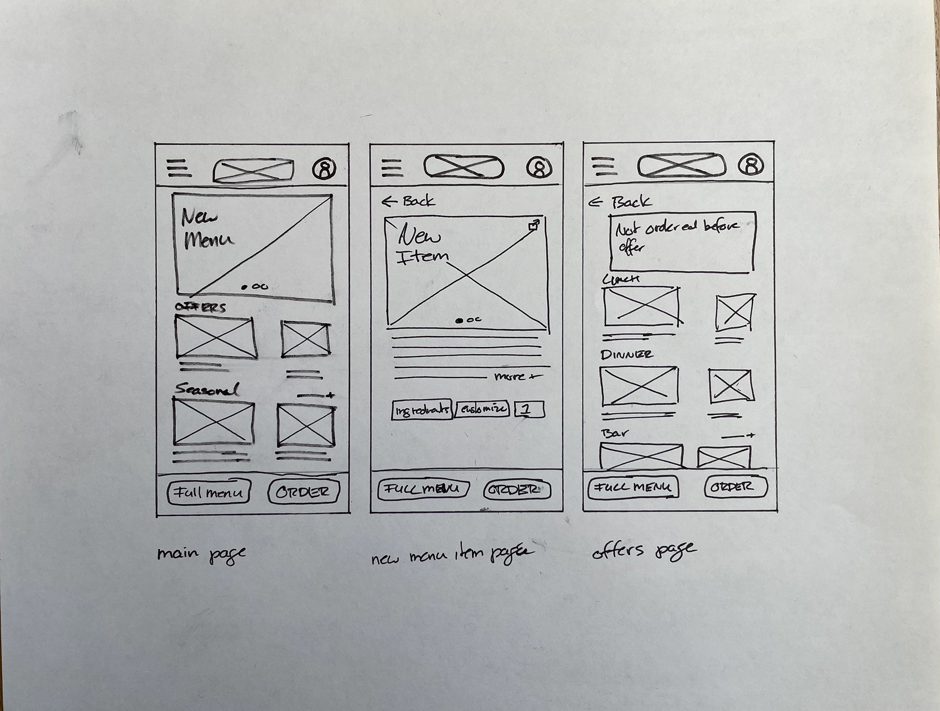
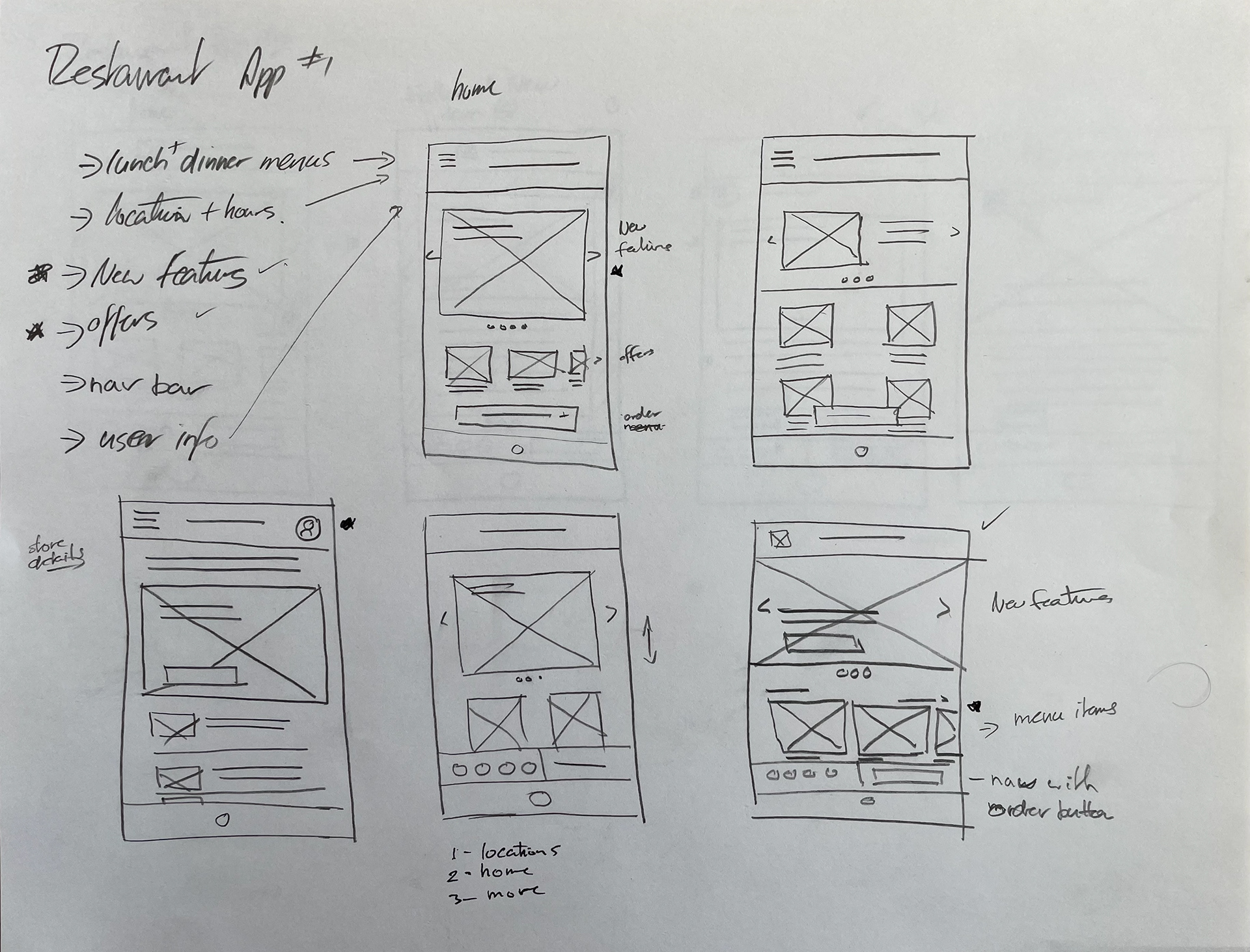
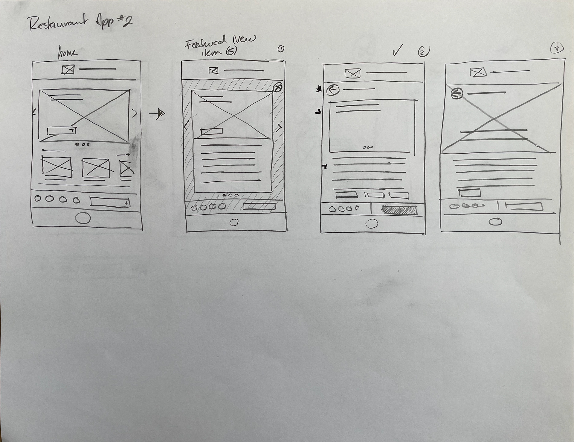
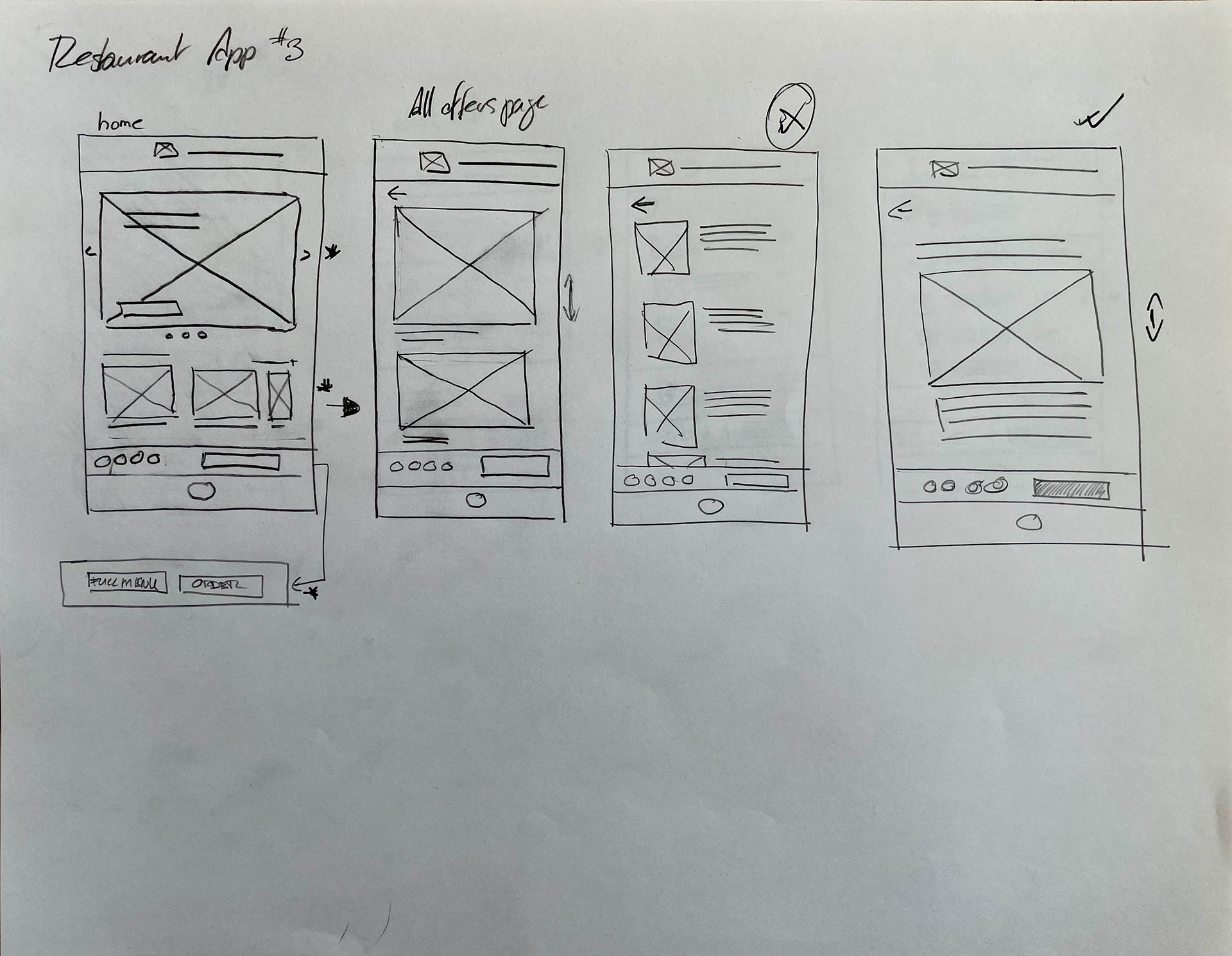
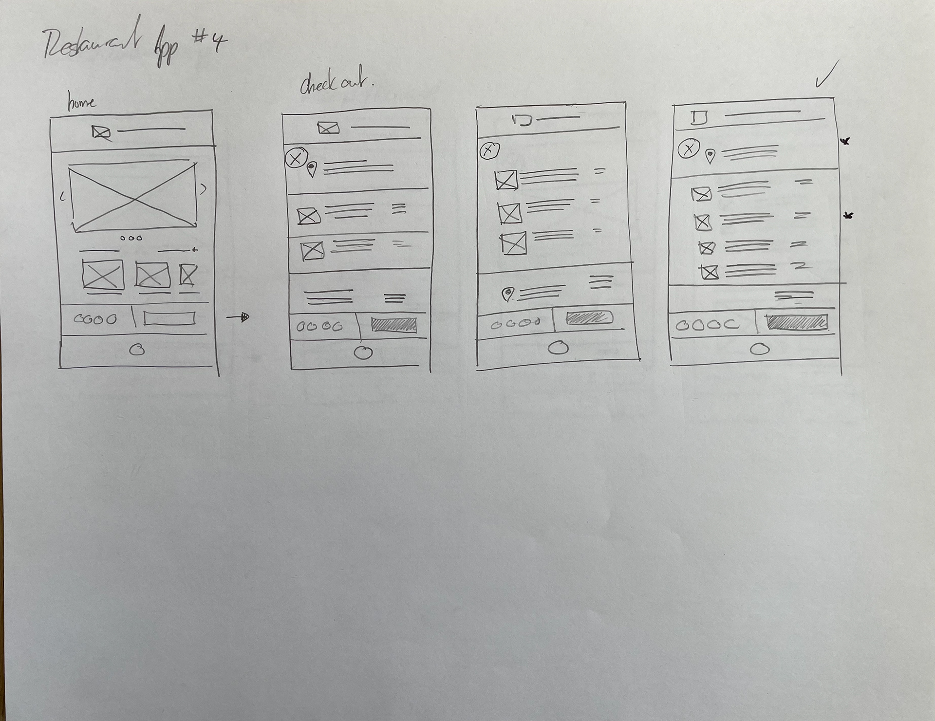
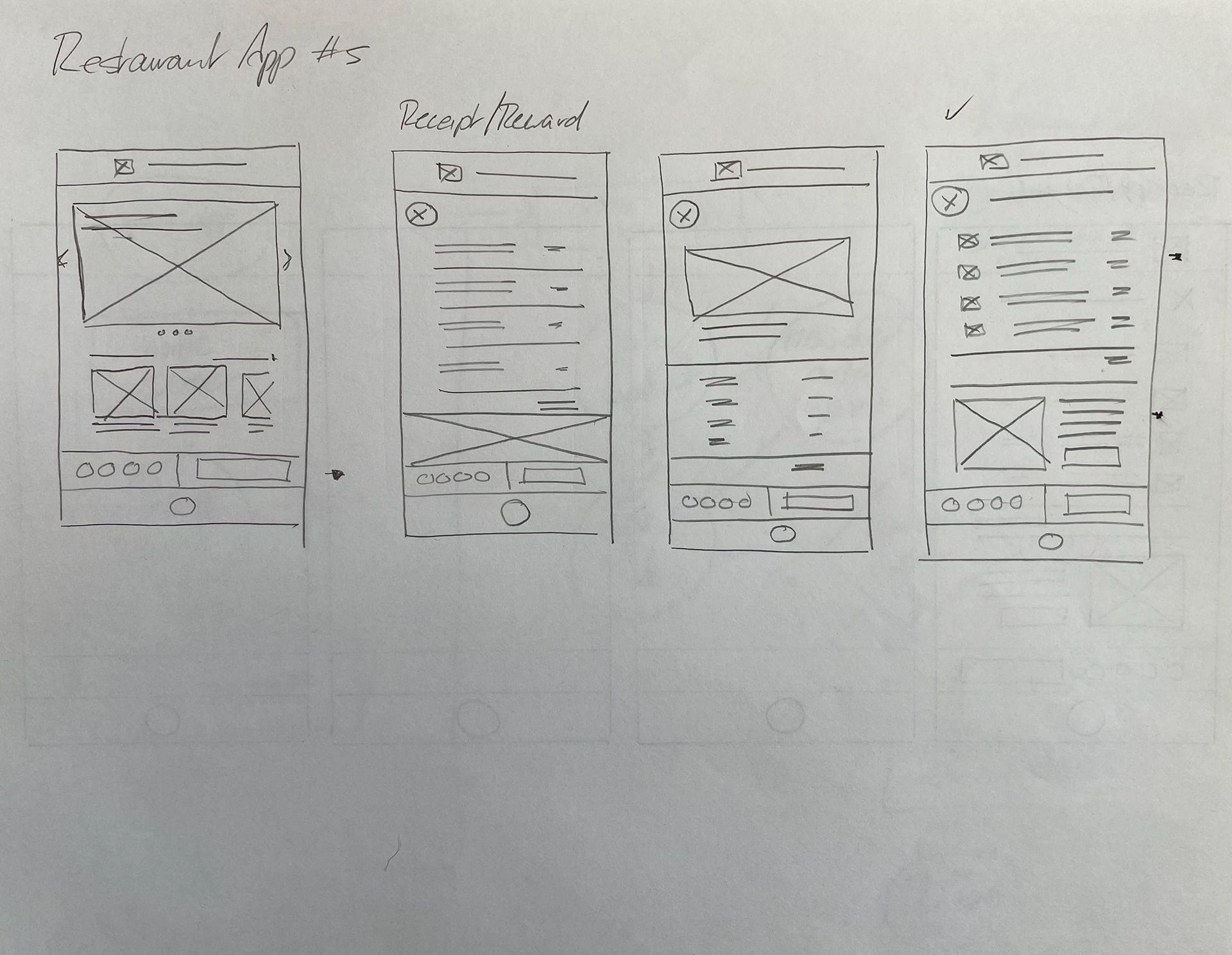
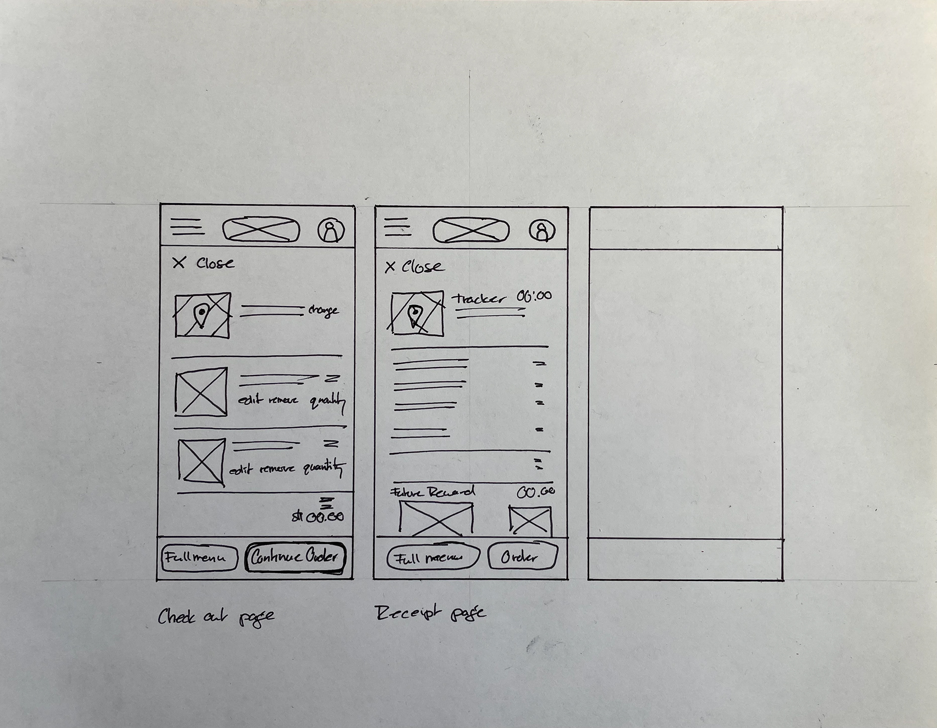
Low-Fidelity Prototype
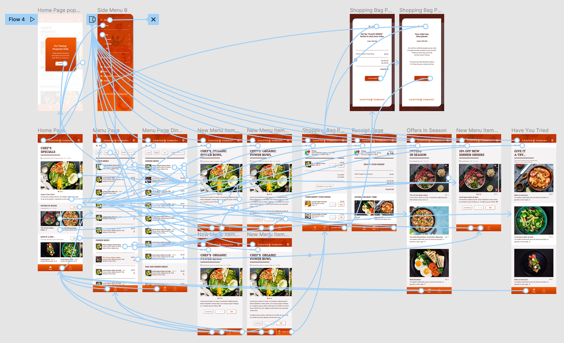
From paper to digital, the biggest hurdle to overcome was the “order” logic and figuring out when to be a pop-up focused page vs. a content page that's outside of the “shopping” sequence.
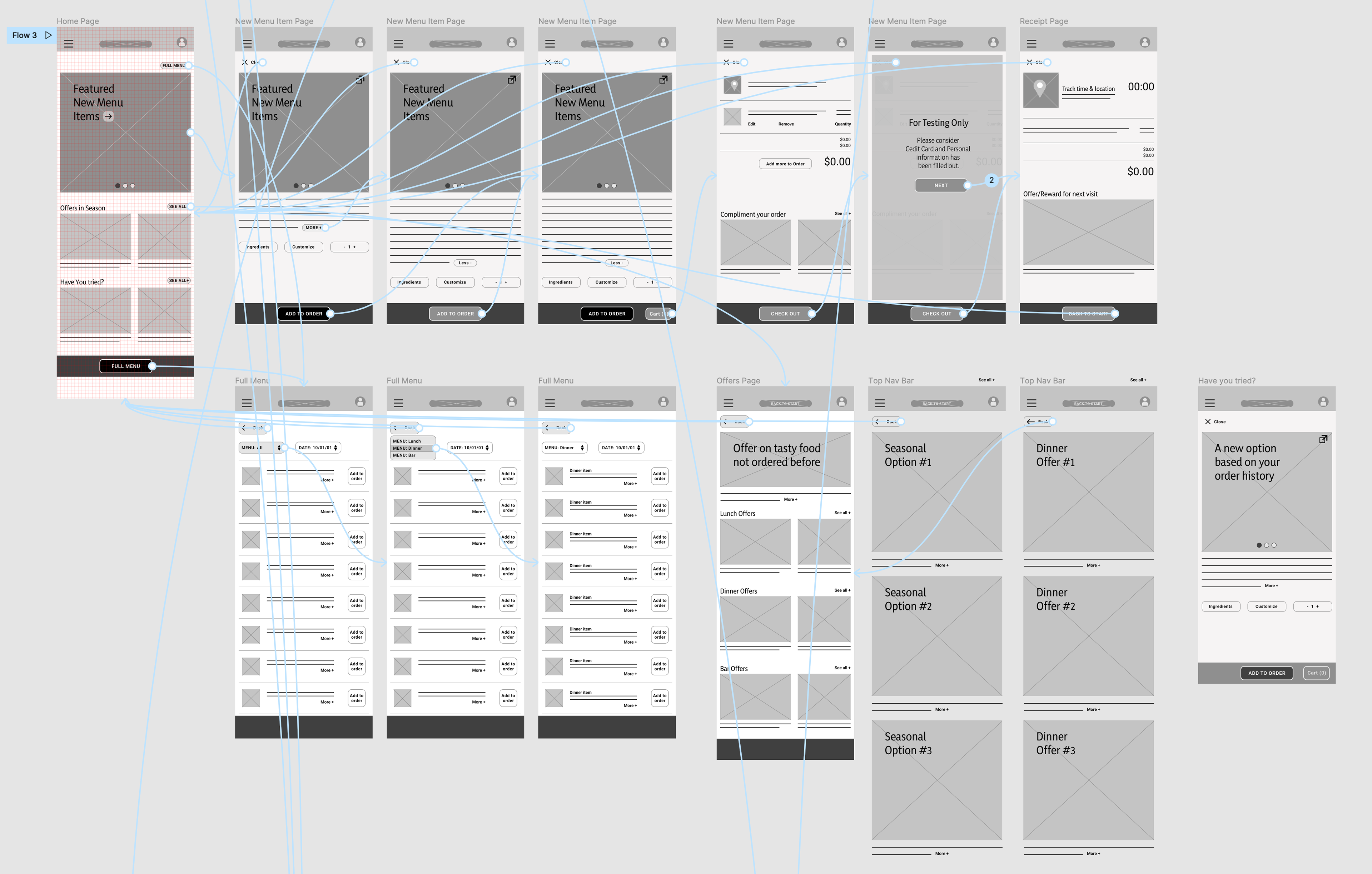
A simple user flow for the Tasty's Tomato app that prioritizes new food for the customer.
Usability Study Results
With two rounds of user testing both low and high-fidelity prototypes highlighted the importance of the user flow and the details associated with the checkout phase of an app.
Round 1 Findings
1. All prototypes need to alert users of shopping details with credit card info.
2. It’s important for users to quickly scan content from the start.
3. Direct/personal language resonates with users.
Round 2 Findings
1. “Confirm Order” should have a summary of the order displayed.
2. Use more direct, actionable language.
3. Adding ratings to menu items would prompt more user curiosity.

High-Fidelity Prototype
The final high-fidelity prototype refined the user flow to help with food discovery and removed frustrations with the checkout flow.
https://tinyurl.com/236w6yme
Conclusion
While designing the Tasty’s Tomato app, I discovered that being sympathetic to all our users’ needs is a really powerful tool, it ensures satisfaction at a basic level. Also being brave in early iterations helps sort out the bugs in later ones.
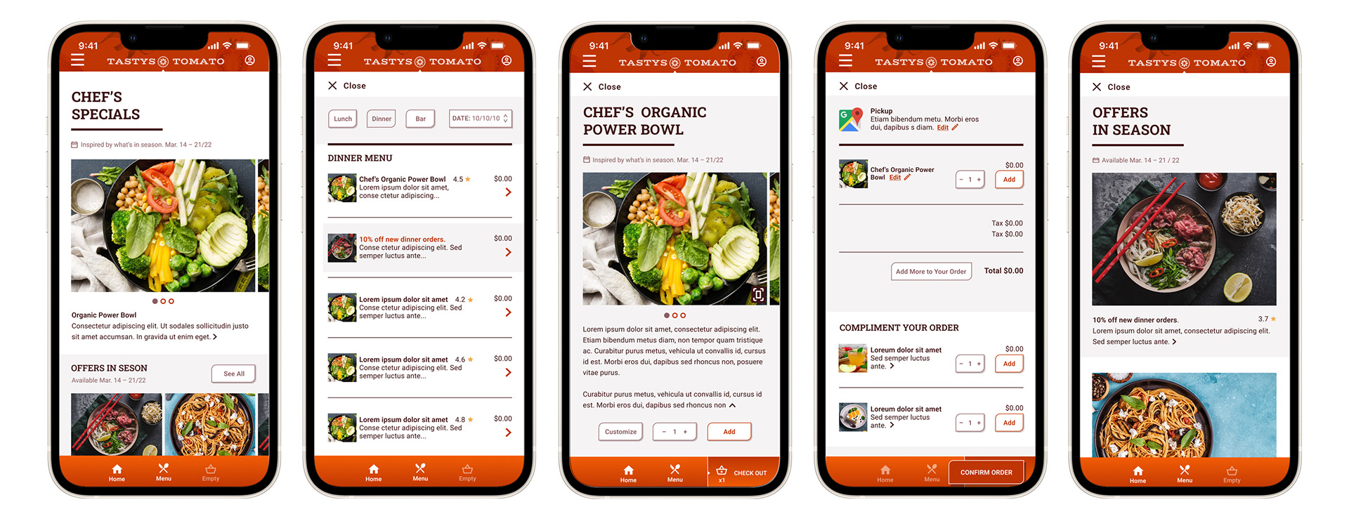
Key Final Screens