Role / Lead UX Designer, UX Researcher
Responsibilities / Conducting interviews, paper and digital wire-framing, low and high-fidelity prototyping, conducting usability studies, accounting for accessibility and iterating on designs.
The Product
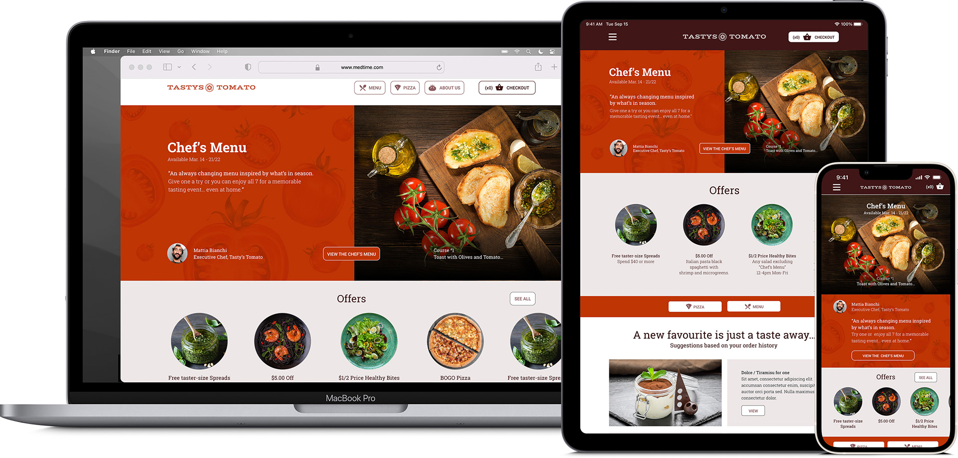
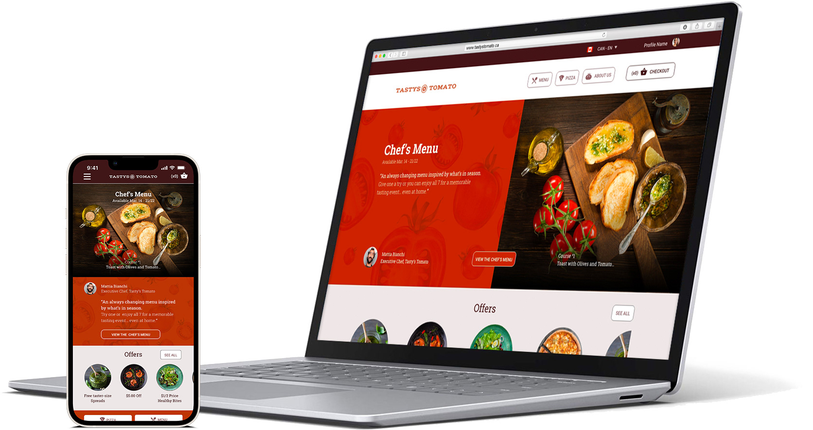
A website for a busy downtown restaurant. “Tasty’s Tomato” has a Chef’s Menu that is always changing and promotes seasonal fresh plates from local suppliers.
The Problem
Restaurant websites are traditionally lacking information and details about all their food offerings. This creates a scenario where customers only order the food they have tried or ordered before.
The Goal
Create an experience that helps people discover the new and exciting dishes the restaurant has to offer, by highlighting the Chef’s Menu and suggesting new, previously not ordered food.
Target Audience
People who live in large urban centres. Sweet-spot adults both male and female 20-40yrs.
User Research
To understand the target group, my primary research method was to interview a range of people who’ve had different experiences when using websites to order from restaurants. A primary user group identified through research was young working professionals who enjoy a rich urban environment and engage in a healthy lifestyle.
My assumption before I started the research was the reason people order the same thing over and over is they lack time and energy. This user group confirmed initial assumptions about restaurant website users, but research also revealed that time was not the only factor limiting users from ordering new food items.
Problem Statement
Aimee is a 29-year-old writer living in a busy city who needs a better way to discover and taste all the city has to offer. Right now, limited descriptions of food items mean she repeats the same food orders again and again.

Starting the Responsive Design
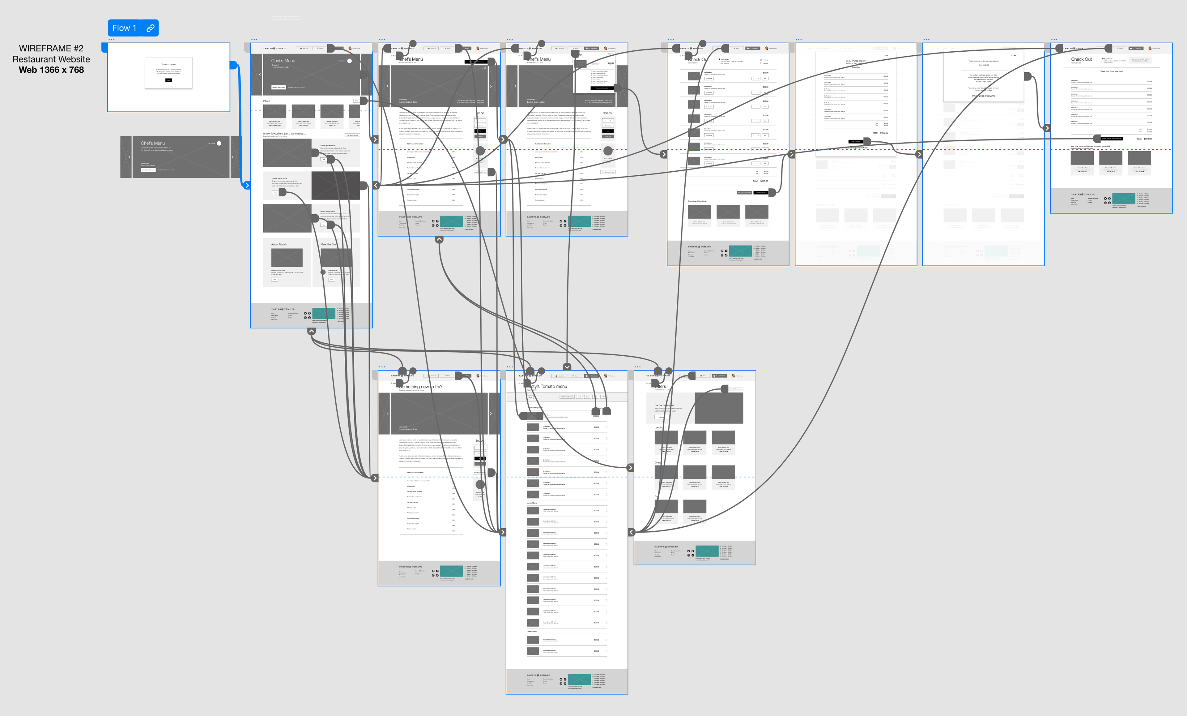
Paper and digital wireframes for each major screen in the user flow were created with user pain points being top of mind.
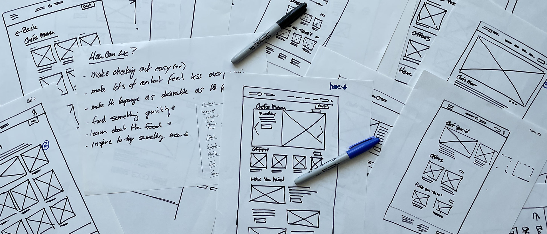
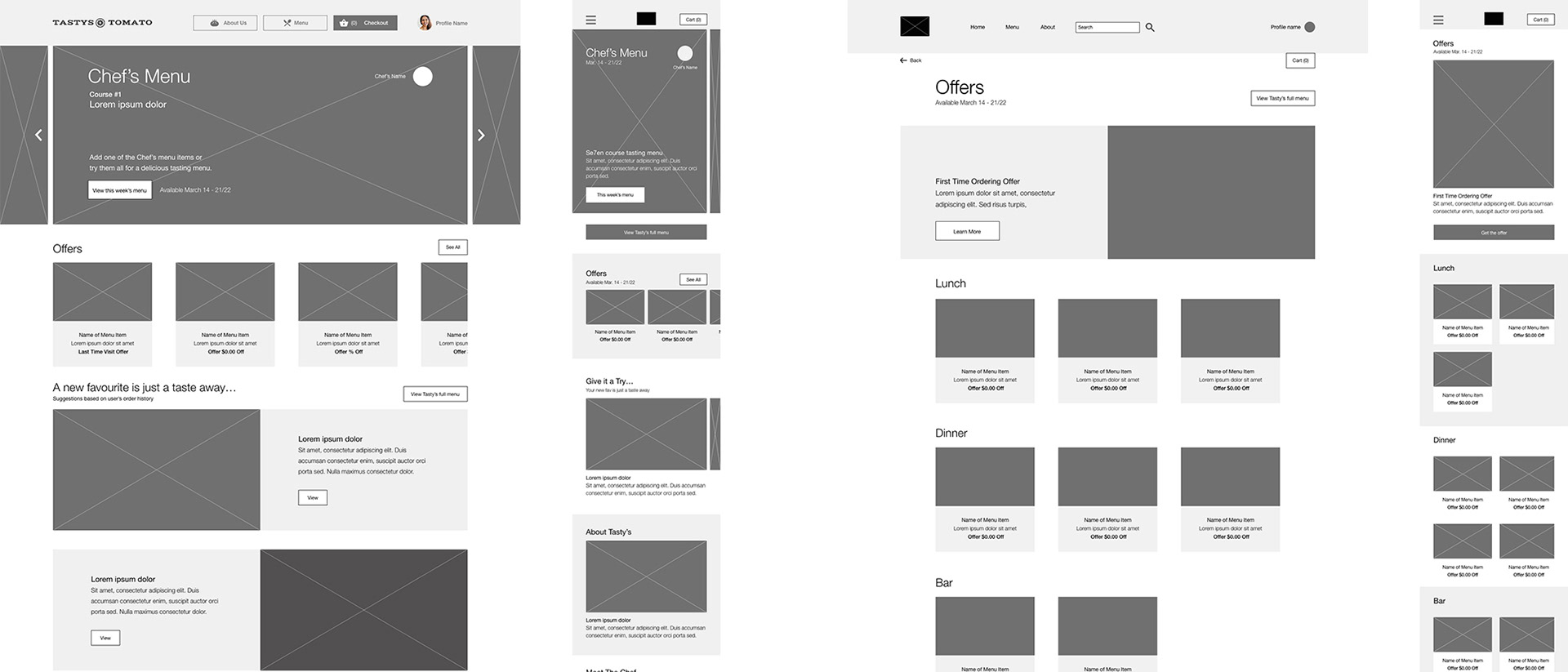
Low-Fidelity Prototype
The screens involved in the primary user flow of adding all the Chef’s Menu items to the basket and then checking out.
Usability Study Results
The main findings discovered:
1. On the homepage users didn’t quite understand the Chef’s Menu is made up of multiple single dishes.
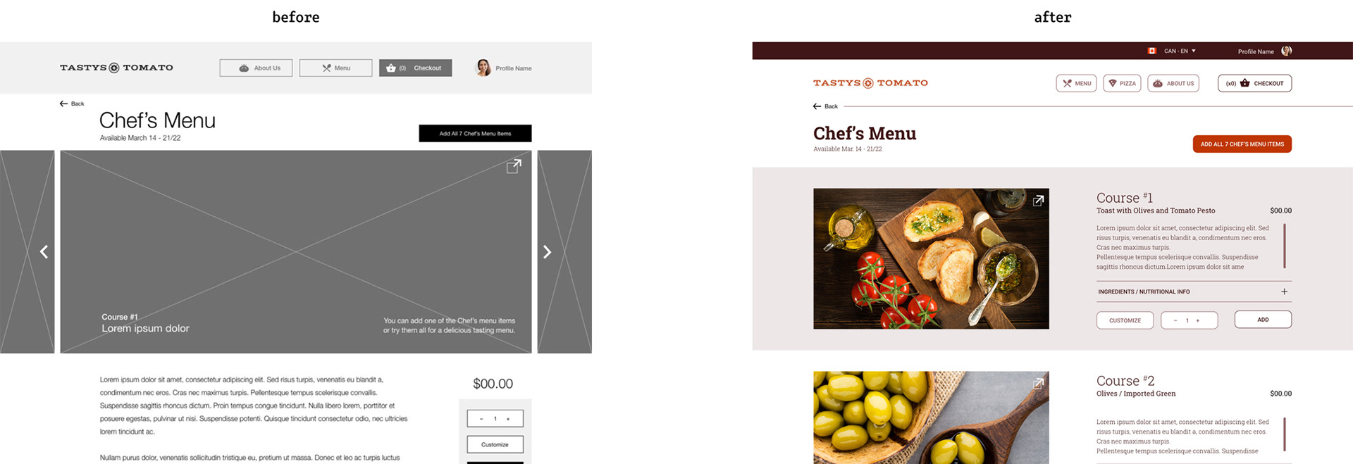
2. Users weren’t able to easily view and add all of the Chef’s Menu items to the basket at one time.
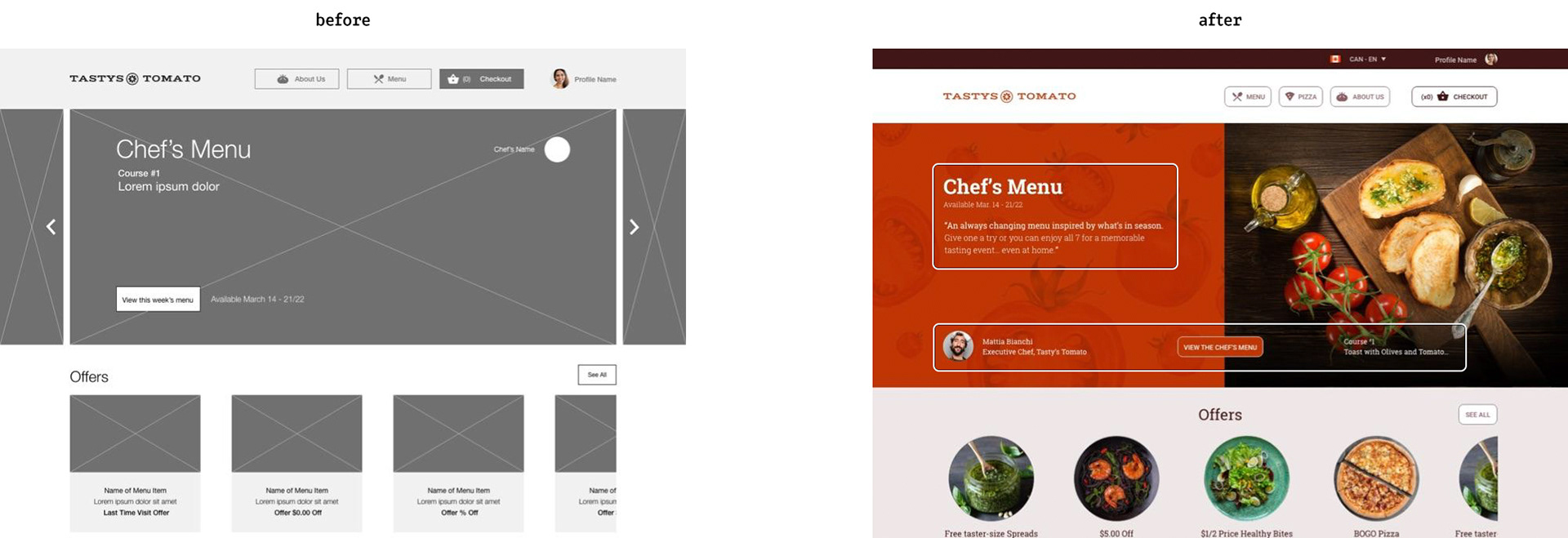
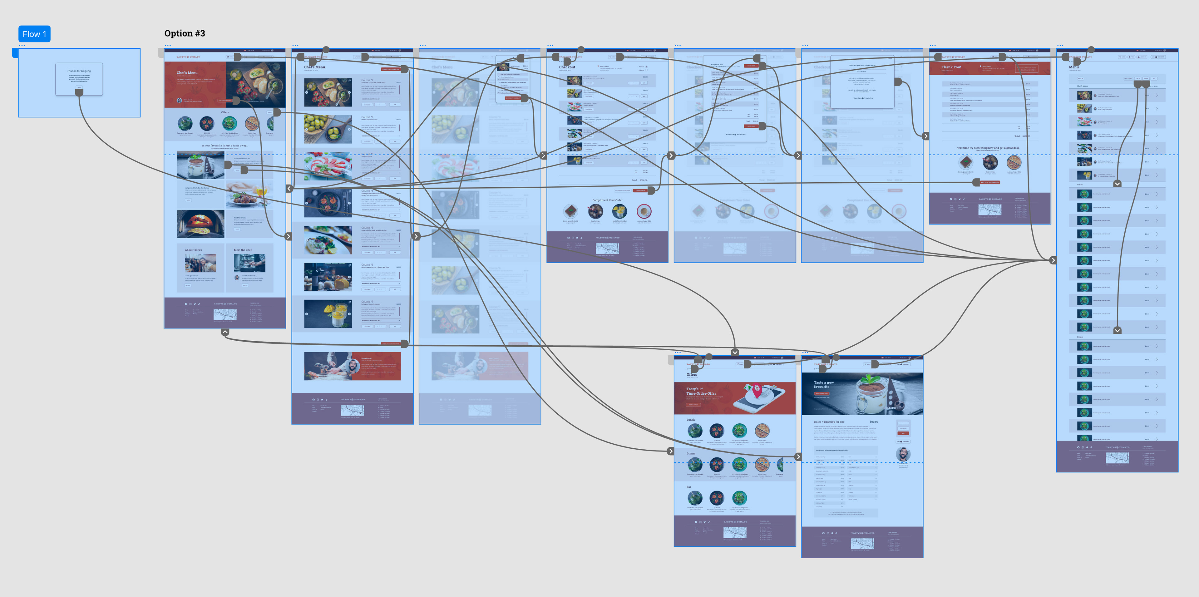
High-Fidelity Prototype
The final high-fidelity prototype refined the process even further by allowing users to scroll and see the Chef's Menu rather than clicking to see more menu items.
Conclusion
Target users shared that the design was easy to navigate and information is intuitively displayed and the images helped clarify the visual hierarchy.
What I Learned
Less isn’t always more – Testing the Chef's page uncovered that putting more information on one long page was a simpler experience than clicking to go to more dedicated pages.